January 18, 2021 - 5 min read
How to visualize complex sets intersections with Python?
Examples about when using Venn diagrams or Upset plots
How to visualize if there are any common elements between lists? Most people will reply with something between “potatoes” and Venn diagrams. Venn works well with two lists, but what if you have three or… six?
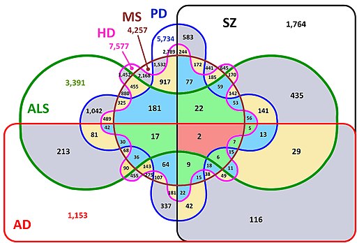
Scientist are not always aiming at best readability, but rather focus on comprehensiveness. This works as long as you share your work with patient and interested colleagues or people evolving in the field. Stakeholders presentations have additional requirements: you have to balance comprehensiveness with readability, they are not specialists.
We will explore how to do this with a simple example: movie genres.
Building movie categories Venn diagrams
First and foremost, let’s load IMDB movie data into a pandas dataframe and import all the libraries that we will need:
import gzip
import io
import pprint
import upsetplot
import pandas as pd
from collections import defaultdict
from matplotlib_venn import venn2, venn3
from matplotlib import pyplot as plt
from urllib.request import Request, urlopen


def load_movie_data(sample=True):
    """
    Directly download and format data into pandas dataframe
    /!\ File is about 130Mb depending on speed connection,
    it might take some time.
    """
    req = Request('https://datasets.imdbws.com/title.basics.tsv.gz')
    req.add_header('Accept-Encoding', 'gzip')
    response = urlopen(req)
    content = gzip.decompress(response.read())
    data = pd.read_csv(io.BytesIO(content), encoding='utf8', sep="\t")
    data = data[data.isAdult == 0]
    if sample:
        # Two percent might seem low but there is approx. 7 million
        # titles without Adult category.
        return data.sample(frac=0.02)
    else:
        return data

data = load_movie_data()

pp = pprint.PrettyPrinter(indent=4)
print("Data column names: ")
pp.pprint(list(data.columns))
print("Data shape: " + str(data.shape))
print("Genres column examples: ")
pp.pprint(data.genres.sample(5).head())
Output:
Data column names:
[   'tconst',
    'titleType',
    'primaryTitle',
    'originalTitle',
    'isAdult',
    'startYear',
    'endYear',
    'runtimeMinutes',
    'genres']
Data shape: (146135, 9)
Genres column example:
6711046       Music,Short
5159561    News,Talk-Show
2496837            Comedy
6745879             Short
5418258      Comedy,Short
Name: genres, dtype: object
Next, let’s see how many movies are in both “Romance” and “Action” categories:
# Reshape data to have for every category,
# a list of movies.
genres_movies = defaultdict(list)
for index, row in data.iterrows():
    try:
        for genre in row["genres"].split(','):
            genres_movies[genre].append(row['primaryTitle'])
    except:
        pass

pp = pprint.PrettyPrinter(indent=4, depth=1)
print("Data structure: ")
pp.pprint(genres_movies)

# Plot a simple Venn diagram and save it to file
venn2([set(genres_movies['Action']), set(genres_movies['Romance'])], set_labels = ('Action', 'Romance'))
plt.savefig("./simple_venn.png")
plt.clf()
Output:
Data structure:
defaultdict(,
            {   'Action': [...],
                'Adult': [...],
                'Adventure': [...],
                'Animation': [...],
                'Biography': [...],
                'Comedy': [...],
                'Crime': [...],
                'Documentary': [...],
                'Drama': [...],
                'Family': [...],
                'Fantasy': [...],
                'Film-Noir': [...],
                'Game-Show': [...],
                'History': [...],
                'Horror': [...],
                'Music': [...],
                'Musical': [...],
                'Mystery': [...],
                'News': [...],
                'Reality-TV': [...],
                'Romance': [...],
                'Sci-Fi': [...],
                'Short': [...],
                'Sport': [...],
                'Talk-Show': [...],
                'Thriller': [...],
                'War': [...],
                'Western': [...],
                '\\N': [...]})
Here is the resulting Venn diagram:
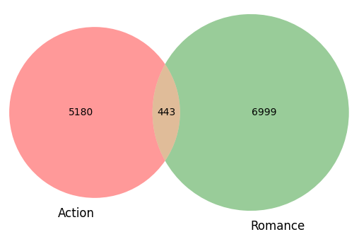
It is perfectly readable, almost anybody can grasp what it means quickly: 443 movies in this sample have the two categories. Similarly, you can add one category and use the venn3 function:
venn3([set(genres_movies['Action']), set(genres_movies['Romance']), set(genres_movies['Drama'])], set_labels = ('Action', 'Romance', 'Drama'))
plt.savefig("./large_venn.png")
plt.clf()
Which generates something similar to:
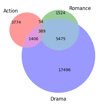
And this is still very reasonable. What if you’d want to have a few extra categories? Well, at least with matplotlib-venn, you can’t! I don’t know how much of a design choice it is, but given the first example, for the sake of readability, I think it is a brilliant limitation (this not the case with other libraries/languages, for example with R - venn diagrams.
“But I really need to show 4 categories!
And they are business cases where it is actually useful, but not with Venn diagrams.
Visualize complex sets with Upset plots
Luckily, some people have thought hard on the problem and came up with upset plots. The initial implementation is in R, but it also exists in Python, here is how to start:
genres_movies_set = dict()
for k, v in genres_movies.items():
    genres_movies_set[k] = set(v)

def plot_upset(genres_movies_set, movie_categories, filename):
    upset_data_sub = upsetplot.from_contents({k: v for k, v in genres_movies_set.items() if k.startswith(movie_categories)})
    upsetplot.plot(upset_data_sub)
    plt.savefig(filename)
    return

plot_upset(genres_movies_set, ('Action', 'Romance'), "./simple_upset.png")
Output:
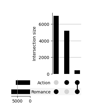
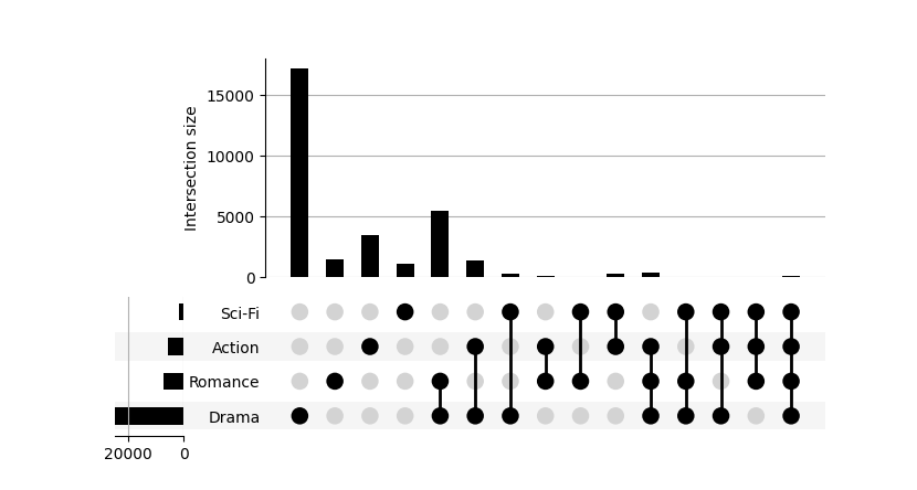
How to read it? The first element is to look at the dots, every black dot, indicates the concerned category/ies. Then, your eyes should shift to the top bar chat which tells you that for the given categories, you have that many movies. Two or more connected dots, indicate movies that have multiple categories.
If it helps, it is based on the same data as the Venn with two sets, just presented differently. It is a bit unusual, but once your brain process the novelty, it actually works very well.
What about the bar chart on the left? If we take the example of the “first line of dots”, it represents the addition of all the movies that are categorized in “Action” movies whether they are only in “Action” or also harbor “Romance” tag.
For two categories, it is clearly an overkill, but look at what happens with four:
plot_upset(genres_movies_set, ('Action', 'Romance', 'Drama', 'Sci-Fi'), "./large_upset.png")
Output:
Conclusion
There is nothing wrong wit Venn diagrams, it is just a matter of knowing how and when to use them. This was a short introduction to explore their limits and open to a less well-known alternative: Upset plots. They are not perfect either, they work in certain situations and the expected readers/viewers should be willing to invest a minimal amount of energy into reading them. The biggest advantage is that when you do need to study complex intersecting sets, you now have the visual tool to do so.
From there, where to go? I showed here only the core principles of Venn diagrams and upset plots. If you are interested in readability, you could start thinking about colors, highlight bars (yes that is possible), font size and high resolution outputs.
Every plot type has a working window, as data professionals, I think it is a part of the job to know them and choose accordingly.
Extra
I wrapped up everything in the following gist that can be run with a simple python3 ./create_movie_venn_upset_charts.py.
References
- The banana (Musa acuminata) genome and the evolution of monocotyledonous plants. Angélique D’Hont, France Denoeud, et al. Nature (2012) doi:10.1038 / nature11241 (published online July 11, 2012)
- Jake R Conway, Alexander Lex, Nils Gehlenborg UpSetR: An R Package for the Visualization of Intersecting Sets and their Properties doi: https://doi.org/10.1093/bioinformatics/btx364
- Alexander Lex, Nils Gehlenborg, Hendrik Strobelt, Romain Vuillemot, Hanspeter Pfister, UpSet: Visualization of Intersecting Sets, IEEE Transactions on Visualization and Computer Graphics (InfoVis ‘14), vol. 20, no. 12, pp. 1983–1992, 2014. doi: https://doi.org/10.1109/TVCG.2014.2346248