img

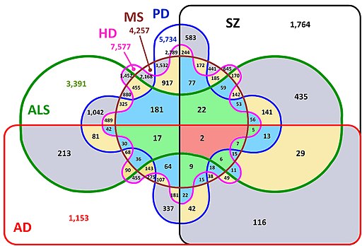
How to visualize complex sets intersections with Python?

Examples about when using Venn diagrams or Upset plots

How to visualize if there are any common elements between lists? Most people will reply with something between “potatoes” and Venn diagrams. Venn works well with two lists, but what if you have three or… six? Read more

img

Where does your cup of coffee come from?

A case study on coffee market with a systems perspective.

Did you ever wonder how this seemingly simple cup of coffee ended in front of you? Would it taste any better if you’d know the efforts made by 25 million people to bring it to your table? Read more
img

Facing Covid-19 death toll curves

How to handle live pandemic data with data literacy?

Nowadays, media and governments are sending messages that can be confusing at times but, we can all increase our data literacy and bring serenity to the way we read and understand data. Read more
img

Clear charts with Matplotlib

How to build Matplotlib charts that people actually want to read and use.

Data science is a lot about convincing people, showing what you have found, what patterns you actually understood. Charting comes a long way in this exercise. Sadly many scientific libraries allow you to produce charts that harbour poor default designs choices. Read more

Copyright 2023 - Mikael Koutero. All rights reserved.

Privacy Statement